Pages in this section:
List view
4️⃣ Section 4: Analysis
🔎 Analysing a file
📚 The Library
📃 The Report tab
📃 The Analysis tab
📷 Screenshotting your maps
✨ Transforms Filters: Tracing paths
✨ Transforms Filters: Zoom
✨ Transforms Filters: Focus or exclude factors
✨ Transforms Filters: Top factors and links
✨ Transforms Filters: Combine opposites
✨ Transforms Filters: Remove brackets
✨ Transforms Filters: Include or exclude hashtags
✨ Transforms Filters: Collapse factors
✨ Transforms Filters: Autocluster
✨ Transforms Filters: 🧲 Magnetic labels
🎨 Formatters: Overview
🎨 Formatters: Link label position
🎨 Formatters: Labels
🎨 Formatters: Labels - Tally
🎨 Formatters: Labels - Surprise
🎨 Formatters: Sizes
🎨 Formatters: Colour factor text red
🎨 Formatters: Translation
🎨 Formatters: Colour links
🎨 Formatters: Colour factors
🎨 Formatters: Label wrapping
🎨 Formatters: Factor spacing
📊Tables tab overview
🔗 The Links Table
👥 The Sources Table
📊 The Factors table
📜 The Statements Table
💬 The Mentions Table
❓ The Questions Table
⚒️ The Closed Question Blocks Table
📕 Comparisons
All sections:
Autocluster
Summary
Motivation
Often we have more labels that we really want. People like simple maps with 3-10 factors. 30 is about the maximum number you can possibly squeeze onto a map, and if you do you’ll not want more than 30 or 40 links.
BUT for overview summaries, we want to provide maps with a high link coverage, close to 100%, meaning that nearly all the original links are actually included in the current map. Otherwise, we are just showing a small selection of what people actually said.
One way to do this is with zooming. It’s a way to reduce the number of factors while retaining the link coverage (because we don’t throw away links, we only reroute them to higher level factors).
BUT zooming requires hierarchical factor labelling.
Disadvantages:
- It is a lot of work
- It means taking a lot of decisions about what hierarchy best fits the data
- It doesn’t help where our coding (manual or auto) has produced parent factors with similar meaning eg Improved Health and Better Health.
- It doesn’t help where our coding (manual or auto) has produced other factors which might fit into the hierarchy but aren’t labelled as such eg Mental health; more optimistic might fit well under Improved Health.
Solution
The idea of autoclustering is to take all the factor labels and group them into clusters with similar meaning.

- Use the slider to choose a “granularity” level between 0 and 100. Usually only values between 40 and 70 are interesting.
- A more permissive value like 45 means that smaller clusters are joined together into a smaller number of larger clusters. Lower values mean fewer factors without losing link coverage, which is good, but there is a danger of clustering dissimilar things together, which is bad.
- A very strict value like 65 means that only very similar labels are clustered together into quite a large number of small clusters.
- The best granularity level depends a bit on the number of factors, so with a smaller file you might get good results at around 50, and with a larger file around 60.
Clustering method
You can now choose the clustering method. Previously we had been using “complete” but we now support (and suggest as default) the “average” method. We found that “complete” is more likely to produce confusingly similar clusters like “Economic factors” and “Economic issues”, whereas “average” produces larger clusters, which is good because far more of the data (the original causal links) are included.
The items in the dropdown refer to the means of calculating the distance between clusters in order to join them, except for kmeans which refers to a completely different clustering method. Kmeans is very quick but does not usually produce good results.
Our process at this stage is still focused on finding exactly the right set of cluster labels, and then we will re-assign the raw labels to the revised set of cluster labels once we agree on them.
Below are questions interesting to ask when you are looking at the list of clusters:
- Do the clusters make sense to you?
- Are they the labels you would like to see (most of) on the final maps?
- Do you think they do a good job of covering the material?
- Or perhaps you can see one you would like to split into two, or a pair you would like to merge?
To do this, you may also look at the contents of each cluster (the raw labels assigned to them) in case you think any of the cluster labels are missing the point of the main contents or putting a wrong accent on them. But don't worry at this stage if you see a few raw labels which don't exactly fit the clusters. We can deal with those later. At this stage our focus is only on getting the cluster labels right.
Once we establish a solid list of clusters, we will try again automatically assigning the raw labels to them and only at that stage worry about the individual raw label assignments.
Labelling
Usually you will keep the Labels control set to
new.Labels = new
As well as clustering the factors, the app then also tries to choose a good label for them. It chooses the label of one of the factors in each cluster as a label for the whole cluster, picking one which is both typical in meaning but also short. Overall:
- The app usually does a good job of clustering the factors, as long as you are careful not to be too permissive; or if you do set a permissive granularity value, be careful how you interpret the results.
- The app does not do a very good job of finding a suitable label for each cluster without zooming, however the top-level parts of the labels are usually good.
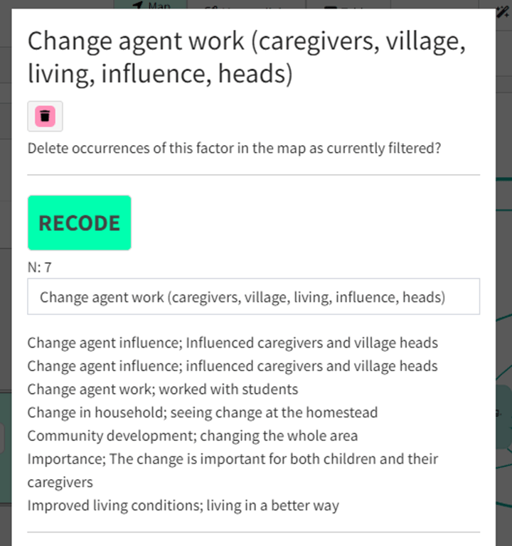
- You can check what factors are included in each cluster by clicking as usual on a factor in the map. You will see that there is now a button called
Recodeand underneath it, an editable label automatically chosen for the cluster, and a list of the factors included in the cluster.

- The number
Nshows the number of factors in the cluster.
- The clusters are listed in order of descending
N.
- Here are some bad things to look out for. If you see more than a few of them, increase the granularity.
- Things with positive and negative valence in the same cluster
- Increases and decreases of the same thing in the same cluster
- The app has focused on the second level more than the first level, so for example it puts things like Improved health; children, More problems; children, Need for education; children in the same cluster.
You can autocluster at any point in the transform chain, so for example it is also possible to zoom to level 1 first and then autocluster just the top-level labels.
AI labels for clusters
You can also create automatic labels with the magic-wand 🪄 button.
This produces labels which mostly have additional keywords, these are in ((double brackets)) so you can distinguish them from the ordinary auto labels which use single brackets.

Saving your label sets
It is not possible to reassign factors between clusters, and you probably won’t want to. But for publication and presentation purposes, you may well want to provide nicer labels than those auto generated by the app.
If you want to make changes to the labels, you can save them in a label set.
The label sets are saved to the server but are separate from the file. So they are not, for example, restored if you restore an earlier version of the file.
Label sets should get applied correctly if you save a view of your file, using a particular label set, in 📚 The Library.
Each label set has a unique number.
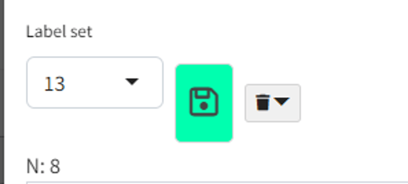
You can create and edit label sets either from the factor modal which you see either when clicking on a factor or by clicking
Manage button in the transforms widget:
As soon as you press the Save icon in either dialog:
- if
Label setsis set tonew, you create a new label set - even if you have only changed one thing.
- if
Label setsis set to a number, you are editing an existing label set.
From the Manage dialog, you can even save your changes to a different label set:

- so for example if you were editing set 13, and select
new, and press the Save icon, you will create a new label set containing your changes.
For each file you can have as many “relabel sets” as you want.
If you select an existing label set, then the set with the number you selected becomes active, and the factors will be grouped into clusters specified in your selected label set and given the label specified in that label set. The granularity slider is then ignored.