Pages in this section:
4️⃣ Section 4: Analysis
🔎 Analysing a file
📚 The Library
📷 Screenshotting your maps
✨ Filters: Tracing paths
✨ Filters: Zoom
✨ Filters: Focus or exclude factors
✨ Filters: Top factors and links
✨ Filters: Combine opposites
✨ Filters: Remove brackets
✨ Filters: Collapse factors
✨ Filters: Include or exclude hashtags
✨ Filters: Autocluster
✨ Formatters: Colour factor labels
✨ Formatters: Colour links
🪄 Formatters: Surprise
✨ Formatters: Tally
🔗 The Links Table
👥 The Sources Table
📊 The Factors table
📜 The Statements Table
💬 The Mentions Table
❓ The Questions Table
⚒️ The Closed Question Blocks Table
📕 Comparisons
All sections:
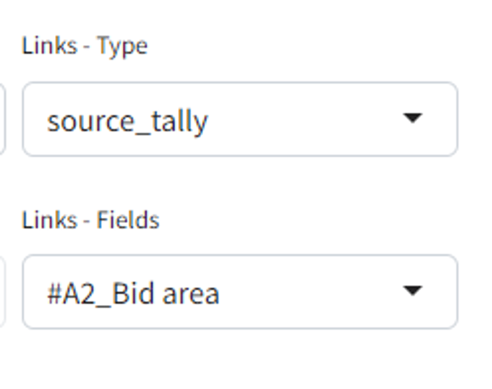
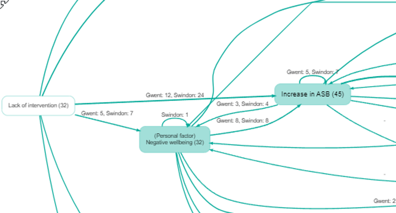
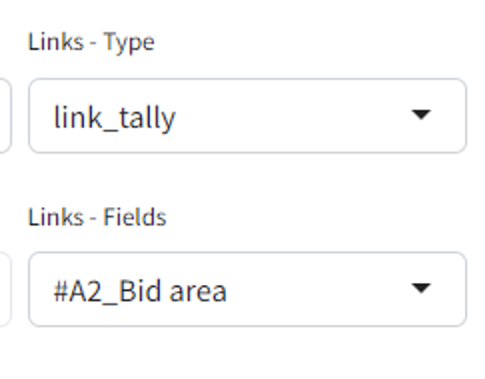
Showing a tally for each group on links
How can we compare different groups like districts, gender or questionnaire sections, within maps?
If you are interested in the significance of the differences, look at the
surprise filter.This one is much simpler. We simply print out the number of links or sources within each group.
We do not yet have the equivalent formatting for factors.
Link and source tallies are simply a printout of all the frequencies for each group; might be useful, might be hard to interpret especially when the overall membership of each group is different (eg more boys than girls overall). The
surprise formatter cuts to the chase by only printing out what is actually noteworthy.