Pages in this section:
4️⃣ Section 4: Analysis
🔎 Analysing a file
📚 The Library
📷 Screenshotting your maps
✨ Filters: Tracing paths
✨ Filters: Zoom
✨ Filters: Focus or exclude factors
✨ Filters: Top factors and links
✨ Filters: Combine opposites
✨ Filters: Remove brackets
✨ Filters: Collapse factors
✨ Filters: Include or exclude hashtags
✨ Filters: Autocluster
✨ Formatters: Colour factor labels
✨ Formatters: Colour links
🪄 Formatters: Surprise
✨ Formatters: Tally
🔗 The Links Table
👥 The Sources Table
📊 The Factors table
📜 The Statements Table
💬 The Mentions Table
❓ The Questions Table
⚒️ The Closed Question Blocks Table
📕 Comparisons
All sections:
Surprising links
How can we compare different groups like districts, gender or questionnaire sections, within maps?
For example, in a map dealing with education and training we can look at each link and ask whether it was mentioned more often by girls or by boys.
Consider a link from
Got training to Got a job. It was mentioned by 12 of the boys and only 6 of the girls. ㅤ | mentioned the link | didn’t mention the link | total |
girls | 6 | 18 | 24 |
boys | 12 | 36 | 48 |
total | 18 | 54 | 72 |
But as you can see, there were also more boys than girls in the sample. When you take that into consideration, you’ll see that the proportion of girls mentioning the link was the same as the proportion of boys, namely 6/24 = 12/48 = one quarter. So if we are interested in differences, we can ignore that link.
We’re going to ask, for each link, to show for which of the members of a specific group (eg females within the group Gender, or for different domains within an interview protocol), the link is mentioned surprisingly frequently (given on the one hand the total number of links mentioned by this group in the whole map, and on the other hand the total number of times this link was mentioned by everyone). So it’s a two-dimensional comparison. What the algorithm does is, if the overall mentions of a link don’t differ significantly between group members, just print the number of mentions as usual; but if it’s significant, print a ↗️ symbol and then list only the group members which mention this link surprisingly often, with the most surprising first. (We actually use a 2-way chi-squared test.)
It’s important that we don’t print out any extra information for links with no significant differences between groups. This way your eyes go straight to what is important and you don’t waste a lot of time poring over each link.
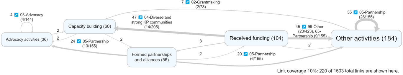
All that might sound like a lot of complicated faff, but when it comes to interpreting the map, it’s quite simple. Here you can see that (above) we want to look at the difference in answers for different transcript sections, which in this case are called “statement_code”. The link at the top of the diagram below was particularly often mentioned in the Grantmaking section. (In this particular map, coincidentally, only one section is printed on each link because in no case was there more than one group which stood out.) You can check by looking at the numbers. eg in the top link, there were 7 mentions altogether, of which 2 were in the section grantmaking out of 78 causal claims in all the grantmaking sections; and altogether there are 1503 links (see bottom right), so 2/7 mentions of this link are from grantmaking, nearly a third, is a lot more than you’d expect given that there only 78 grantmaking links altogether out of 1503, i.e. about 5%.
You might say ah but this is based on citation counts, we should look at source counts, it’s more conservative …. and indeed you have this option in the UI if you select Surprise_sources instead of Surprise_links. So this asks, for each link, which transcript sections was mentioned by a surprisingly large number of sources rather than just “surprisingly often”.
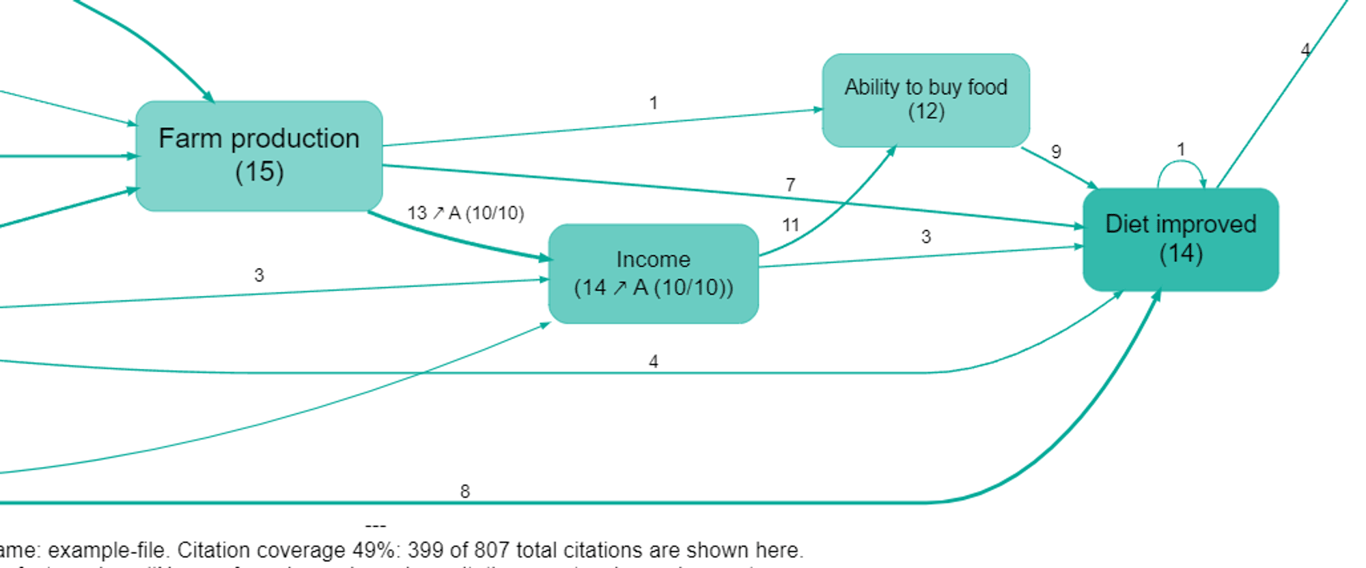
Surprise calculations are also available for factors. This map uses surprise_sources for both links and factors. We can see that (in the map as currently filtered) 14 sources mentioned Income, of whom 10 were from Province A. We know this is a lot, because all 10 of the sources from Province A who are included at all in the map as currently filtered mentioned this factor (10/10)). Similarly, of the 13 sources who mentioned a link from Farm Production to Income, 10 were from Province A.